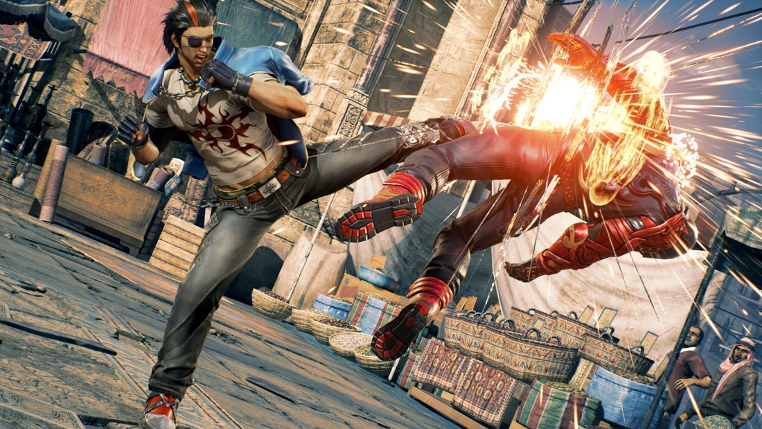
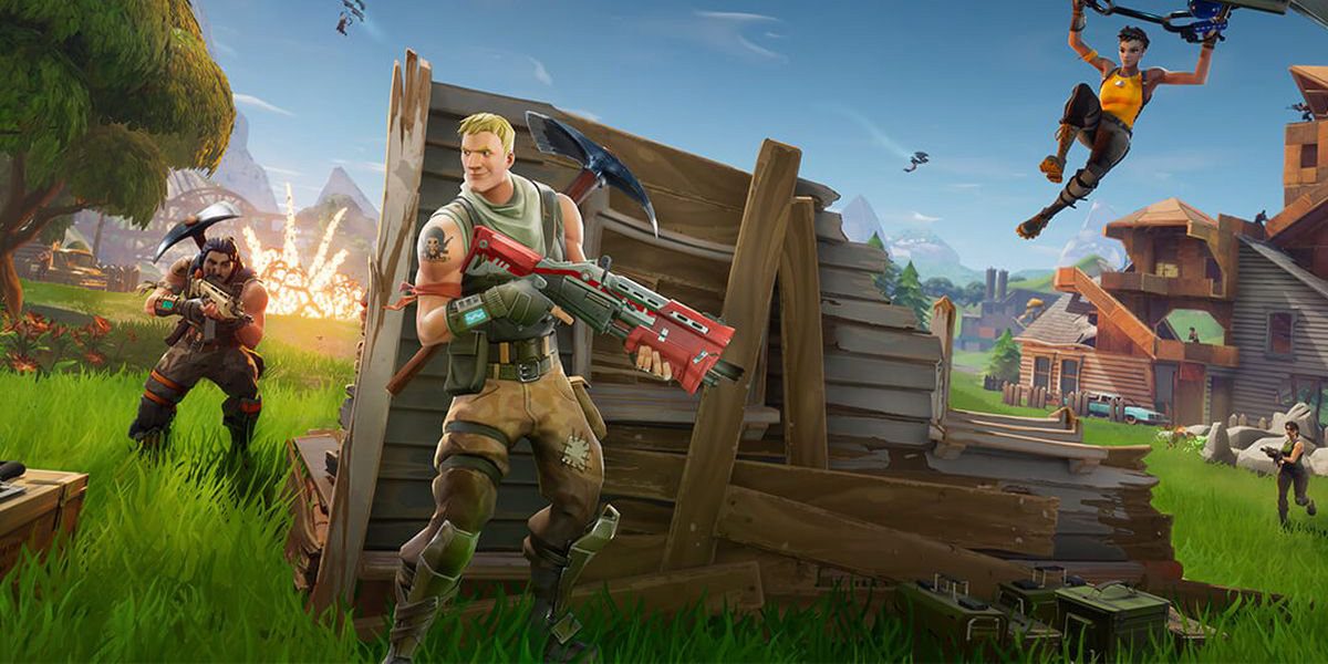
  What are the design elements that set these two games apart? The first game, Tekken 7 does a great job of showing texture. For example, Kuma the bear has fur but without texture you might just think it's a brown blob. Relating to emphasis, Tekken 7 did a good job of making a giant flash whenever you hit the other player really hard, giving you the impression that you did more damage. Some of the characters in Tekken 7 are bigger than others, so that you don't always think you will beat the other player. Size can make you more scared or frightened. In Tekken, the characters are usually very close to one another, making it more fast paced and intense. The characters in this game are usually very aligned so they aren't bent in too unnatural ways or shapes. The two characters are very different shapes and sizes, so there’s a lot of contrast among the characters making you want to explore more. For the second picture, which is of Fortnite, has a very different feel to it. Fortnite is even more animated, so there is little to no texture in this game. Fortnite emphasizes the bullets coming from the guns, making you more anxious or stressed out. All of the characters are the same size so that it creates a sense of fairness in this game. In Fortnite, the characters are not close together at all, they are spread out among an island. In Fortnite there are a lot of unnatural shapes so it’s not as aligned. In Fortnite, there is a ton of contrast relating to color. The vibrant hues in this game make you feel as if you are in a cartoon, it's very bright. Tekken image: “TEKKEN 7.” PlayStation™Store, store.playstation.com/en-ae/product/EP0700-CUSA06014_00-PS4TEKKEN7000001.
Fortnite image: “Fortnite for Android Has 15 Million Players and Counting, Epic Talks Fragmentation, Preventing Malware.” Google, Google, 9to5google.com/2018/09/07/fortnite-android-fragmentation-malware-player-count/.
0 Comments
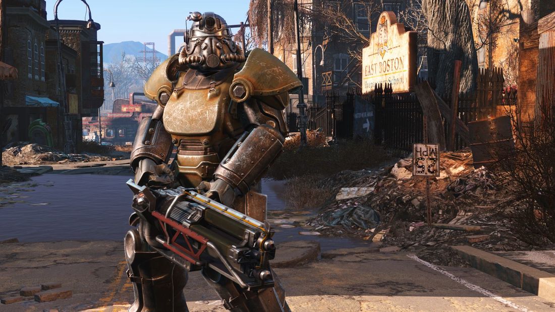 This is an image from Fallout 4. This game takes place after a nuclear war happened, where there are demolished buildings and radioactive monsters. The mood of this game isn't happy, so of course the game developers wouldn't put in colors that invoke feelings of happiness and peace. The colors in this game are more muted so that it looks more realistic and makes you think of real life catastrophe. The main colors of this picture are red, orange, yellow, blue, and purple. Red is a color that makes you feel aggressive or angry, which would make sense in this game because your home got destroyed and you are constantly being attacked by monsters. Orange makes you feel excited, making you want to continue to play the game for a long time; it keeps you from getting too bored. Yellow activates the anxious part of your brain, making you feel more immersed in the game. The darker blue in this picture gives a feeling of somberness, again not making you happy or joyous; this color makes you feel serious. The purple in this image can give off vibes of mystery, making you want to explore the game more and find out its' secrets. I think that the developers of this game chose these colors so that you would feel alert and serious, but adding in a few choice colors like orange to make you feel excited and want to play more. If the developer only added in the angry and serious colors, chances are that you wouldn't want to play the game as much because it would give off vibes of serious depression and anxiety. This game is meant to be adventurous but full of perils to meet you along the way, not to scare you away from it entirely. Picture credit: “Fallout 4 Guide: How to Find and Recruit All 12 Companions.” GearNuke, 12 Nov. 2015, gearnuke.com/fallout-4-guide-find-recruit-12-companion
Link: https://gearnuke.com/fallout-4-guide-find-recruit-12-companions/ |
